Few design objects have travelled further than the small glazed brick that once lined the Paris and New York undergrounds. Metro tiles left the platforms a century ago and have since covered more kitchens, bathrooms, bistros and coffee shops than any other tile format in history, without ever once looking out of date.
In this guide we cover what makes a tile “metro”, the three readings of the format in the catalogue, the eternal white and the colours beyond it, and the layouts and grout choices that decide whether your wall says Paris bistro or modern gallery.
The original is precise: a small glazed ceramic brick, roughly twice as wide as tall, with a softly bevelled edge that catches the light, designed in the 1900s to make underground stations bright, hygienic and easy to clean. Those three virtues explain the format’s escape to the surface: they are exactly what kitchens and bathrooms want.
Today “metro” covers a small family: the classic bevelled brick around 7,5×15, and its modern elongated cousins around 7,5×30, which keep the brick language with a sleeker, more current proportion. Subway tile, the American name for the same idea, describes the flatter, unbevelled reading. Same underground, different accent.
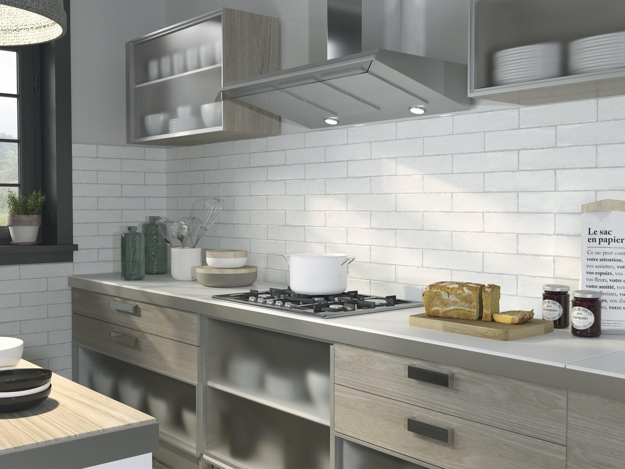
White is where the metro story begins and where most projects still land, for good reason: a white brick wall bounces light, matches every cabinet and tap finish ever made, and carries a hundred years of café charm in its joints.
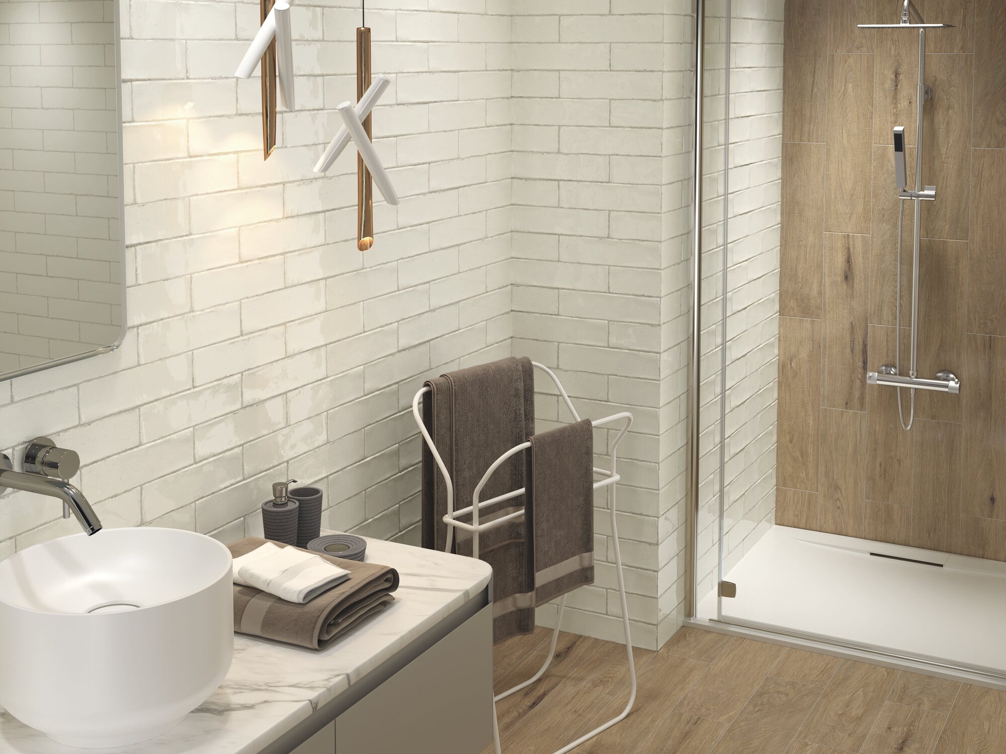
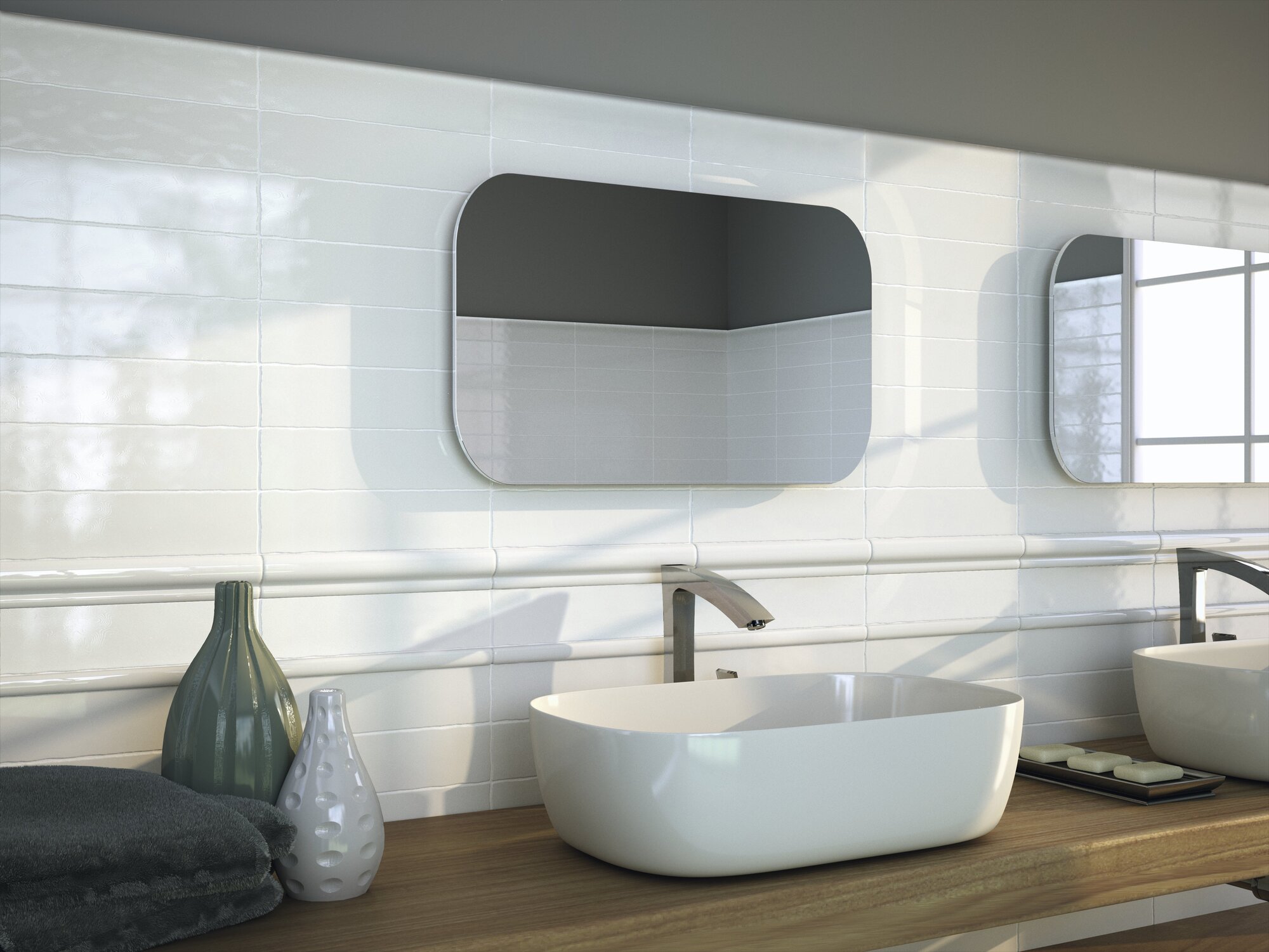
In the bathroom, white metro tiles are the shortcut to bright, timeless walls: brick bond around the shower, a half-height wainscot with a trim piece to crown it, warm wood and white sanitaryware to complete the scene:
The choice inside white is the edge: bevelled pieces animate the wall with shadows and read more period; flat pieces read calmer and more contemporary. Both stay honest in small rooms, where the fine grid adds depth, as our guide to small bathroom tiles explains.
The format wears colour beautifully, because the joints break any tone into lively fragments. Vintage adds Ivory for warmth and Lake for the blue-green retro note; Calpe and Altea bring Sky, Taupe and Ivory for kitchens and bathrooms that want colour with a low voice. Deep tones in glossy metro, bottle green, navy, even black, remain the signature of bistros and bars for a reason: no other format makes saturated colour feel this classic.
Then comes the metro decision: grout. Contrast grout, grey or graphite on white, draws the grid and leans industrial bistro; tone-on-tone melts the wall into soft texture. Neither is wrong; they are simply two different rooms.
The kitchen backsplash remains home turf, from full walls to the strip between worktop and cabinets, and the format shares a backsplash philosophy with its cousin the square, covered in our guide to square kitchen tiles. In bathrooms it rules showers and wainscots. And beyond the wet rooms, metro tiles dress bar fronts, laundry rooms and fireplace surrounds, anywhere a wall wants rhythm, shine and a wipe-clean surface.
For the full retro styling playbook around the format, decades, colours, clawfoot tubs included, our guide to vintage bathroom tiles picks up where the metro wall ends.
A format that has survived since 1900 is past the trend cycle. What rotates is the styling: grout colour, layout and finish update the look every decade while the brick itself stays constant. It is one of the safest tile choices in existence.
Geography, mostly. Metro is the European name, born in Paris, and usually implies the bevelled edge; subway is the American name, born in New York, and usually means the flat version. In practice the terms overlap, and both describe the same 2:1 glazed brick.
Grey grout is the classic bistro reading and hides daily life best; white grout gives a soft, seamless wall but asks for more cleaning in kitchens; dark graphite is the boldest, most graphic choice. Decide by the mood, not by fear: porcelain joints today resist stains far better than the originals.
Metro tiles are the rare classic that needs no reinvention, only good decisions. Choose your edge, the bevel of Vintage, the craft of Calpe or the calm of Altea, pick a layout and a grout with intention, and let the brick that lit the underground keep lighting your walls.


 Return