Selecciona tu idioma
Ask a kitchen designer which colour clients hesitate over and then never regret, and the answer is usually blue. A blue backsplash brings depth that white cannot offer and warmth that grey never manages, it flatters wood, marble and brass alike, and it looks as right in a farmhouse as in a city apartment.
In this guide we cover how to choose your blue, from powder to cobalt, the formats that carry the colour best, the tiled worktop move that doubles the effect, and where else in the house a blue glazed wall earns its keep.
Blue is the rare colour that reads as both calm and characterful. Behind a worktop it adds the depth that an all-white kitchen lacks, without the risk of the louder colours: it hides splashes gracefully, changes mood with the daylight, and gets along with every natural material a kitchen contains, from oak and walnut to marble and steel.
There is also a practical reason designers reach for it: blue sits opposite the warm tones of food, wood and brass on the colour wheel, so it makes everything placed in front of it look better. Few backsplash choices are this forgiving and this photogenic at once.
Colour decides the mood; format decides the character. The handcrafted glazed square, 10×10 or 13×13, is the artisan reading, with each piece catching the light at its own angle so the blue never sits flat. The elongated brick formats open the door to brick bond, vertical stacking and herringbone; decorated pieces like Fado add pattern inside the colour; and the lantern-shaped picket of Frame gives the backsplash a silhouette of its own:
If the square grid is your instinct, our guide to square kitchen tiles covers formats and layouts in depth; everything there applies doubly in blue, because the grid of joints breaks the colour into living fragments instead of one solid mass.
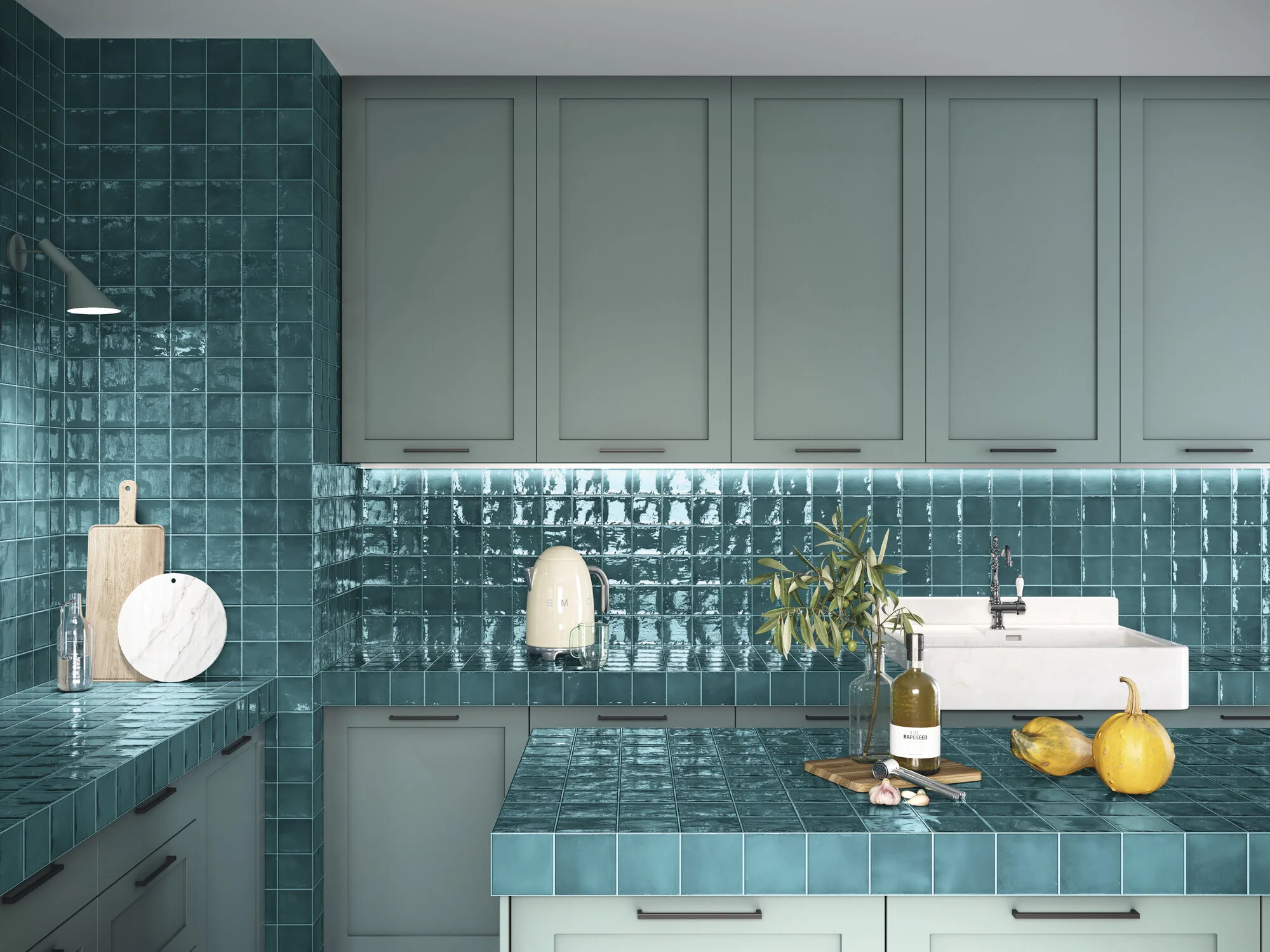
The banner image above hides a second idea worth stealing: the backsplash does not have to stop at the wall. Running the same glazed tile over the worktop, a gesture borrowed from Mediterranean kitchens, wraps the whole working area in one material and makes even a small kitchen feel designed rather than assembled. Glazed porcelain surfaces shrug off heat, knives and lemon juice, which is more than most worktop materials can say.
The half-measure also works: tile the window reveal or the shelf above the backsplash in the same blue, and the colour gains architecture without a full commitment.
A blue glazed front is not exclusive to cooking. Hospitality has adopted it for bar and counter fronts, where the shimmering colour does the brand’s work, and the same blues migrate happily to the bathroom, where a deep glazed wall turns the shower or the vanity into the room’s protagonist. The same collections cover both rooms, so a house can repeat its blue from the worktop to the shower without repeating itself.
Blue has been a kitchen staple since delftware, which is about four centuries of track record. Individual shades rotate, teal is currently ahead of navy, but the colour itself is one of the safest long-term bets behind a worktop.
White, cream, natural wood and sage green are the reliable four. With deep blues, keep cabinets pale; with powder blues, almost anything works, including darker woods and even black in well-lit kitchens.
Glazed gloss is the classic and the practical choice: it bounces light, deepens the colour and wipes clean instantly. Matt blues read more contemporary but show grease sooner, so save them for low-splash zones.
A blue backsplash tile is the rare upgrade that adds character and resale appeal at once. Pick your temperature in Seville, add pattern with Fado or relief with Tiny, consider letting it climb over the worktop, and give the hardest-working wall in the house a colour worth looking at.


 Return